A Guide to Print Digital Artwork Right
June 17, 2026
A guide to print digital artwork with better clarity, color, and paper choices so your pet portrait feels as beautiful in print as it does on screen.
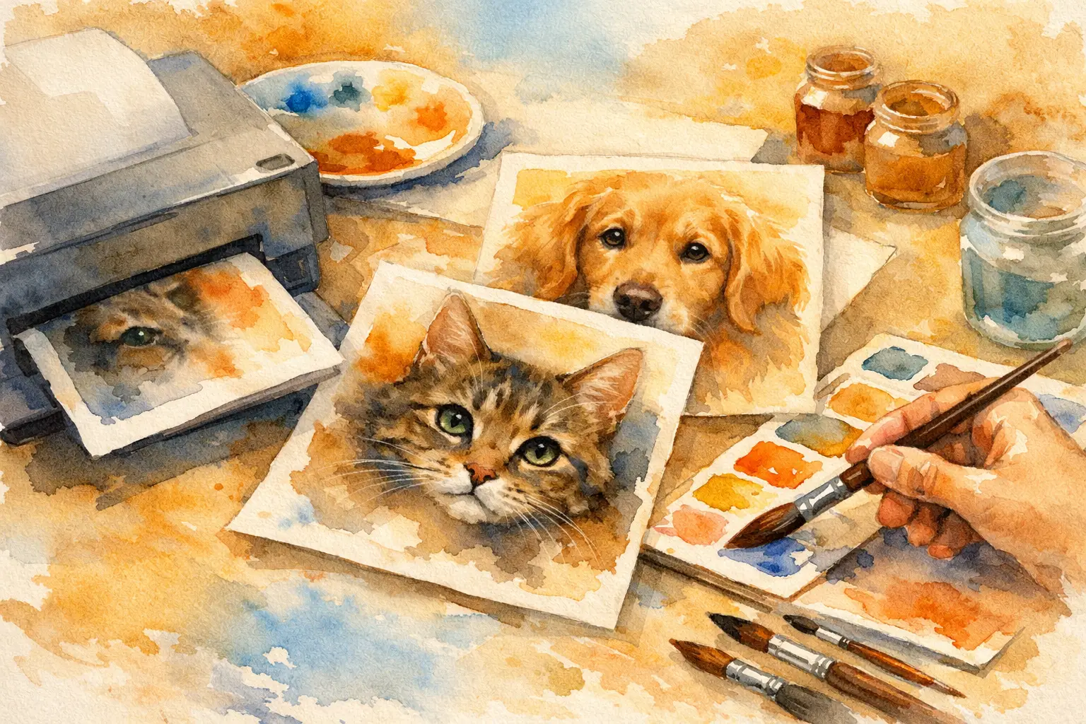
The moment your portrait feels finished on screen, a new question appears: will it feel the same in your hands? A thoughtful guide to print digital artwork matters because a beautiful file is only part of the experience. The paper, size, finish, and print quality all shape whether your pet’s portrait feels like a passing image or a lasting keepsake.
For many pet owners, printing is where the portrait becomes more than a file. It becomes something you can frame, gift, hold, and return to. That is especially true for memorial artwork, where the printed piece often carries a quiet emotional weight. A strong print preserves not only the image, but also the tenderness behind the choices you made while creating it.
Why a guide to print digital artwork matters
Digital art can look luminous on a phone or laptop and still print poorly if the file is stretched, cropped carelessly, or sent to print on the wrong material. Screen light hides certain issues. Print reveals them. Soft brushwork may look delicate online but turn muddy on low-grade paper. Fine details around the eyes or fur can lose presence if the print size is pushed too large for the file.
That does not mean printing digital portraits is complicated. It means the final result depends on a few decisions that deserve care. When the artwork honors a beloved pet, those decisions feel personal. You are not simply ordering wall art. You are choosing how your pet’s presence will live in a physical space.
Start with the file you love most
Before thinking about paper or size, pause at the portrait itself. If you created multiple versions, select the one that still feels true after the first emotional reaction passes. The strongest portrait is not always the one with the boldest color or the most dramatic composition. Often, it is the one that captures expression - the tilt of the head, the softness in the eyes, the calm or playfulness that made your pet unmistakably themselves.
If you are creating through Pet Legacy Portraits, this step is part of the beauty of the process. You are the one shaping the final image. You know your pet better than anyone, and that knowledge matters. The best print begins with the version that feels most honest to your memory or your daily love.
Once you have chosen your final file, avoid making casual edits through random apps or social platforms. Extra filters, sharpening, or contrast changes can interfere with the watercolor softness and tonal balance that made the portrait feel elegant in the first place.
Choose a print size that suits the artwork
One of the most common mistakes in any guide to print digital artwork is treating size as a style choice alone. Size is emotional, but it is also practical. A larger print can feel more ceremonial and present. A smaller print can feel intimate and refined. Neither is better by default.
If your portrait includes delicate facial detail and soft wash textures, mid-sized prints often feel the most balanced. They preserve nuance without asking the image to do more than it should. Going very large can work beautifully, but only if the file supports it and the artwork has enough visual strength for that scale.
Think about distance, too. A portrait meant for a hallway wall reads differently than one placed on a bedside table or bookshelf. Memorial portraits are often most moving when they live in a space that invites closeness rather than spectacle. For a living pet’s portrait, you may want something more prominent, especially if it is part of a gallery wall or central room.
Paper changes the feeling of the portrait
If there is one decision that most shapes the final character of the print, it is paper. Smooth glossy finishes can make color appear brighter, but they may feel too reflective for watercolor-style artwork. They can also pull the image toward a more commercial look, which is not always what you want when the portrait is rooted in affection, remembrance, or quiet beauty.
Matte and fine art papers usually suit digital watercolor portraits better. They soften glare, preserve subtle tones, and support the painterly quality of the image. The result tends to feel more timeless and more natural. If your portrait features gentle neutral backgrounds, soft fur transitions, or muted floral tones, matte paper often helps those details breathe.
Textured fine art paper can be especially beautiful, but this is where preference matters. Too much texture may interrupt very delicate details, especially around the eyes and nose. A lightly textured premium paper is often the most balanced choice - elegant, tactile, and faithful to the artwork without overpowering it.
Color on screen is not color in print
This is where expectations need a little grace. Screens are backlit. Prints are not. That means color may appear slightly less luminous on paper than it does on your device, especially if you are viewing your file on a bright phone screen with high saturation.
That difference is normal. It does not mean the print is wrong. In many cases, a slightly softer printed result feels more sophisticated and more lasting. Watercolor portraits in particular benefit from restraint. They are meant to feel airy, layered, and painterly rather than overly vivid.
If your pet’s coloring is essential to the portrait - a warm golden coat, a deep black cat, a white dog with subtle cream markings - choose a printer known for careful color handling. Dark fur should still hold detail. White fur should not lose dimension and become flat. Good printing keeps those tonal shifts intact.
Cropping deserves more attention than most people give it
A strong portrait can lose its impact through careless cropping. This happens often when a printer automatically adjusts the file to fit a standard size. Ears get trimmed, negative space disappears, or the composition suddenly feels cramped.
Before placing an order, check whether the artwork will be printed exactly as shown or trimmed to match the paper dimensions. If the composition includes soft background space around your pet, that breathing room is part of the portrait. It should not be sacrificed casually.
Square, vertical, and horizontal formats all carry different moods. A close vertical crop may feel intimate and formal. A wider composition may feel gentler and more atmospheric. Let the original artwork lead. Do not force it into a format just because that size is common.
Print quality is about more than resolution
People often focus on whether a file is high resolution, and that matters. But quality also comes from the printer, the ink, the paper, and the care taken during production. A good print should show smooth gradation in soft backgrounds, clear detail in the features, and a finish that feels clean rather than harsh.
This matters even more for artwork created to honor a pet’s memory. You want the piece to feel worthy of the bond it represents. Cheap production can flatten the image emotionally as well as visually. The portrait may still be recognizable, but it will not carry the same depth or presence.
If you are printing for a gift, quality becomes part of the message. It says this was chosen with intention. It says this life mattered.
When to print one piece and when to print several
Not every portrait needs to become a large statement piece. Sometimes one beautiful print is enough. Other times, it makes sense to print more than one version for different parts of your life.
A larger print can serve as the main keepsake in your home, while a smaller version may be right for a desk, shelf, or private memorial corner. If the portrait marks a loss, one copy may be for you and another for someone who shared that love. The same artwork can hold different meanings in different spaces.
The key is consistency. If you print multiple copies, keep the paper and finish aligned so the portrait retains its character across formats.
A printed portrait should feel lasting
The best printed artwork does not call attention to the printing process. It lets you feel the portrait. You notice the expression first, then the softness of the color, then the sense that something beloved has been preserved with care.
That is the real purpose of any guide to print digital artwork. Not to turn a meaningful portrait into a technical project, but to help you protect what made the image special in the first place. When the print is done well, the artwork keeps its dignity. It keeps its warmth. It keeps your pet close in a form that feels real.
Choose the file that feels most true. Print it at a size that respects the image. Give it paper that matches its beauty. Then let the finished piece do what it was meant to do - quietly hold love in plain sight.